
Decide what the photograph should communicate
Start with the picture you hope customers, members, guests, or employees will take. Should it feel energetic, elegant, playful, local, dramatic, or unmistakably connected to your brand? A gym photo wall might celebrate progress and movement. A restaurant might create a sense of place. A wedding venue may need a flexible backdrop that complements different events.
Choose one main idea. A wall becomes harder to photograph when it tries to carry a slogan, logo, detailed scene, decorative border, and several calls to action at the same time.
Leave a clear standing zone
The center of the design does not need to be visually empty, but it should be calm enough for a person or small group to remain the focus. Move the busiest artwork toward the sides, corners, or upper portion of the composition. Negative space can be a shape, glow, arch, star, frame, or softer section of the background rather than a plain blank rectangle.
Mock up at least one adult figure at realistic scale before approving the artwork. For family-oriented spaces, also test a child-height figure and a small group. This reveals whether faces, logos, or important design elements will be blocked in typical photos.
Compose around the person—not behind them
Use artwork to lead attention toward the standing zone. Figures, lines, flowers, architectural elements, or bursts of color can frame the subject from the sides. Avoid placing a detailed face, a key word, or the most important part of the illustration directly behind the spot where a person’s head will usually appear.
If the design includes people, athletes, dancers, animals, or other figures, keep their full poses readable. Cropping a hand, foot, or important gesture at an awkward point can make the wall feel accidental rather than designed.
Place the brand where it survives the photo
A logo usually works best above the standing zone or to one side, with enough contrast and breathing room to remain legible. If it sits directly behind the subject, it may disappear in every photograph. Keep it large enough to read on a phone screen without making it dominate the entire composition.
When a full logo feels too commercial, use a recognizable name, monogram, color system, or short phrase. The goal is for someone to understand where the photograph was taken without turning the wall into an advertisement.
Design for the phone camera
Most visitors will photograph the wall vertically or in a near-square crop. Test the design inside both formats, not only as a wide view of the entire wall. A successful crop should still include the person, the strongest visual elements, and at least one clear brand cue.
Stand where the photographer is likely to stand and check what enters the frame. Exit signs, televisions, doorways, trash cans, and ceiling fixtures can become more noticeable in a photograph than they are in the room.
Check lighting before finalizing color
Photograph the proposed wall at the times when the space is busiest. Strong windows can create backlighting, while overhead fixtures can cast shadows under faces. Dark artwork may lose detail in a dim corner, and highly reflective nearby surfaces can introduce glare.
The solution may be as simple as choosing a different wall, adjusting the composition, or adding appropriate room lighting. Make those decisions before production so the artwork and the lighting support each other.
Protect the space around the photo moment
Allow enough room for a photographer to step back without blocking a doorway, service path, workout area, or dining aisle. Avoid placing the standing point where people will lean against fragile objects or interfere with daily operations. A subtle floor marker can show guests where to stand without adding instructions to the artwork.
For an event space, consider how temporary furniture and décor may change the camera position. For a gym or studio, account for equipment that moves throughout the day.
Keep important artwork inside the printable boundaries
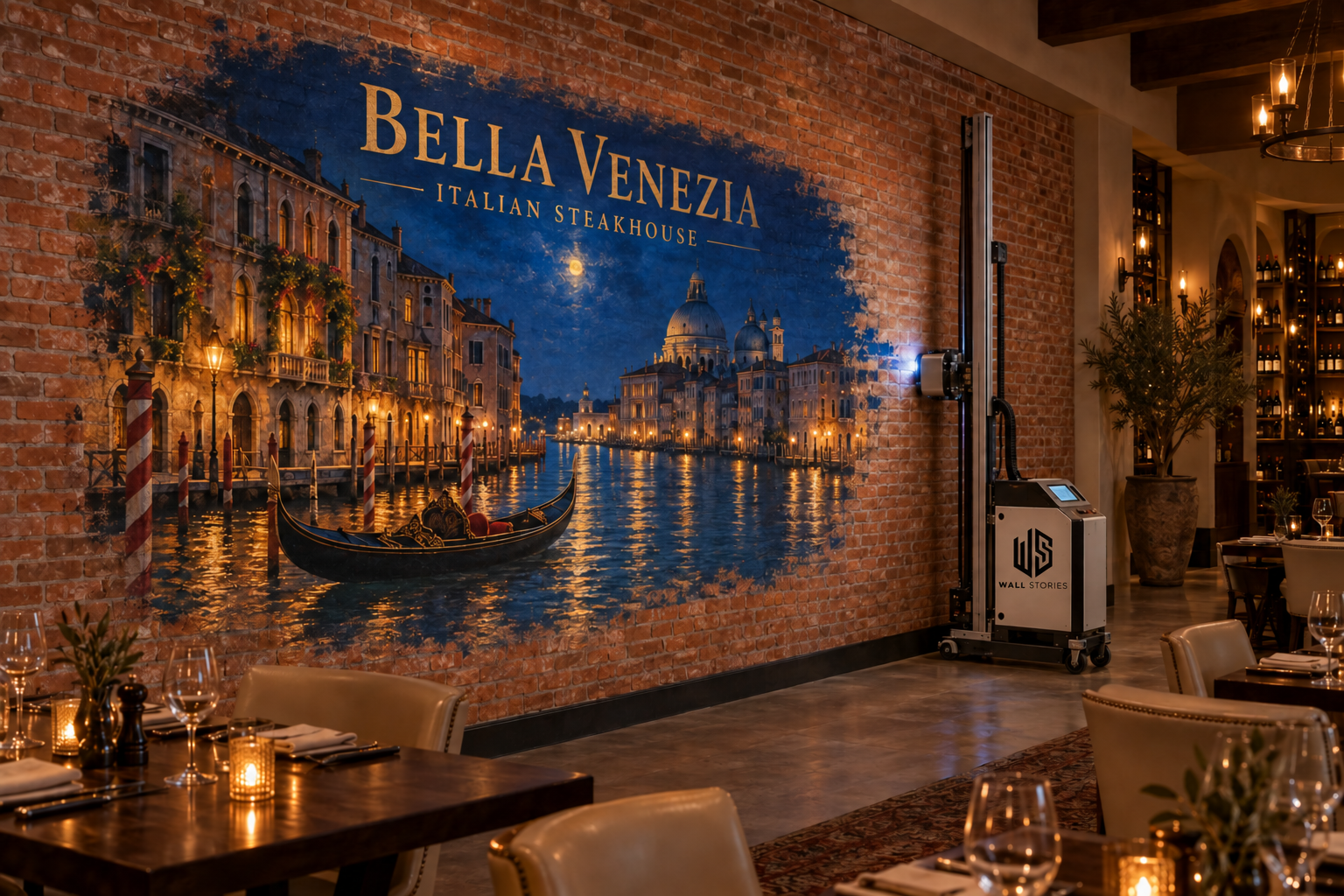
Wall Stories Creative designs printed artwork to feather or fade before the ceiling, floor, left edge, and right edge. Logos, faces, lettering, and framing elements should sit comfortably inside those boundaries. The surrounding breathing room also helps the wall feel connected to the room instead of visually squeezed into it.
Before design begins, gather straight-on and wide photographs, exact wall measurements, nearby furniture dimensions, outlet and fixture locations, and the normal camera position. Our wall-printing preparation checklist explains what to document.
Choose direct printing, vinyl, or a combination
A permanent feature mural may be a strong fit for direct-to-wall printing, while replaceable dates, sponsor names, seasonal messages, or event details may work better as vinyl graphics. Combining a lasting printed background with changeable elements can keep the main photo wall consistent while allowing promotions to evolve.
See our comparison of direct-to-wall printing and vinyl wall graphics when planning the production method.
A quick photo-wall planning checklist
Before approving the concept, confirm the main audience, standing position, photographer position, vertical and square crops, brand visibility, lighting, traffic flow, printable boundaries, and any elements likely to change. Then review the mockup both with and without people in front of it.
For hospitality spaces, our guide to planning a restaurant feature wall offers additional ideas about placement, atmosphere, and guest experience.
Have a photo-wall idea?
Send Wall Stories Creative a photograph of the wall, approximate dimensions, and the feeling you want the finished image to create. We’ll help you plan the standing zone, artwork, branding, and production approach.
Request a consultation